
Brazil is full of girls with talent and curiosity for Science, Technology, Engineering, Art, and Mathematics. Yet, for many, building a future in these fields still feels like a distant dream—an intangible reality. The reasons are many: social invisibility, economic and emotional challenges, gender barriers, and the lack of nearby role models to look up to.
With the mission of mapping these girls across the country and offering resources so they can develop and get where they want to go, the Blooma Institute has arrived to transform this landscape.
Since the beginning of the project, we understood that the brand positioning should not revolve around injustice, fragility, or charity. More than offering opportunities, Blooma creates the conditions for each girl to choose her own path and pursue it with confidence. This insight grounded the brand personality in the Heroine archetype, allowing for bold and inspiring expressions.
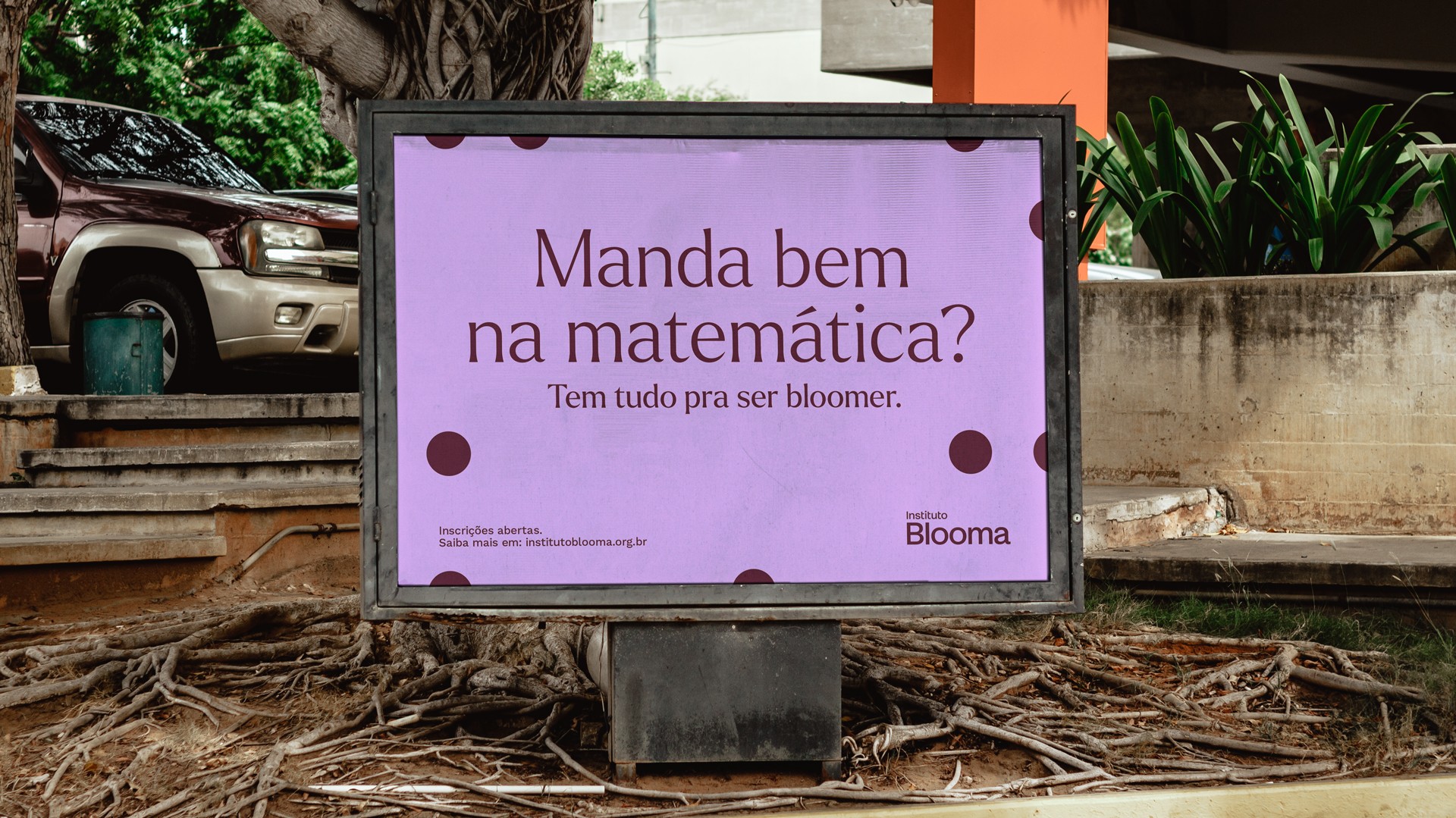
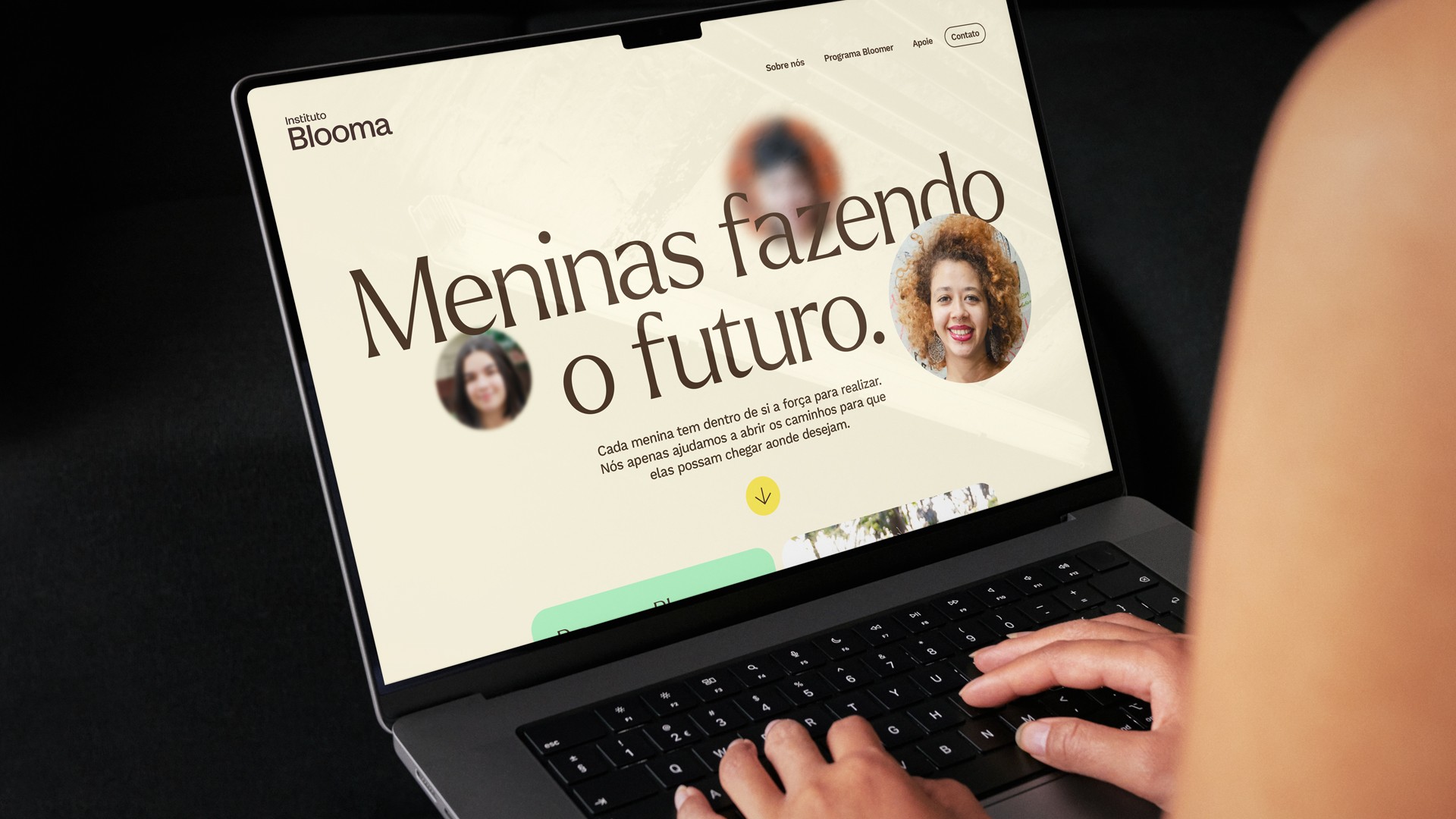
This narrative inspired the tagline "Girls Making the Future." This phrase emphasizes empowerment and reinforces the belief that becoming an engineer, scientist, or even an astronaut need not be a far-off dream; it can be part of everyday life.
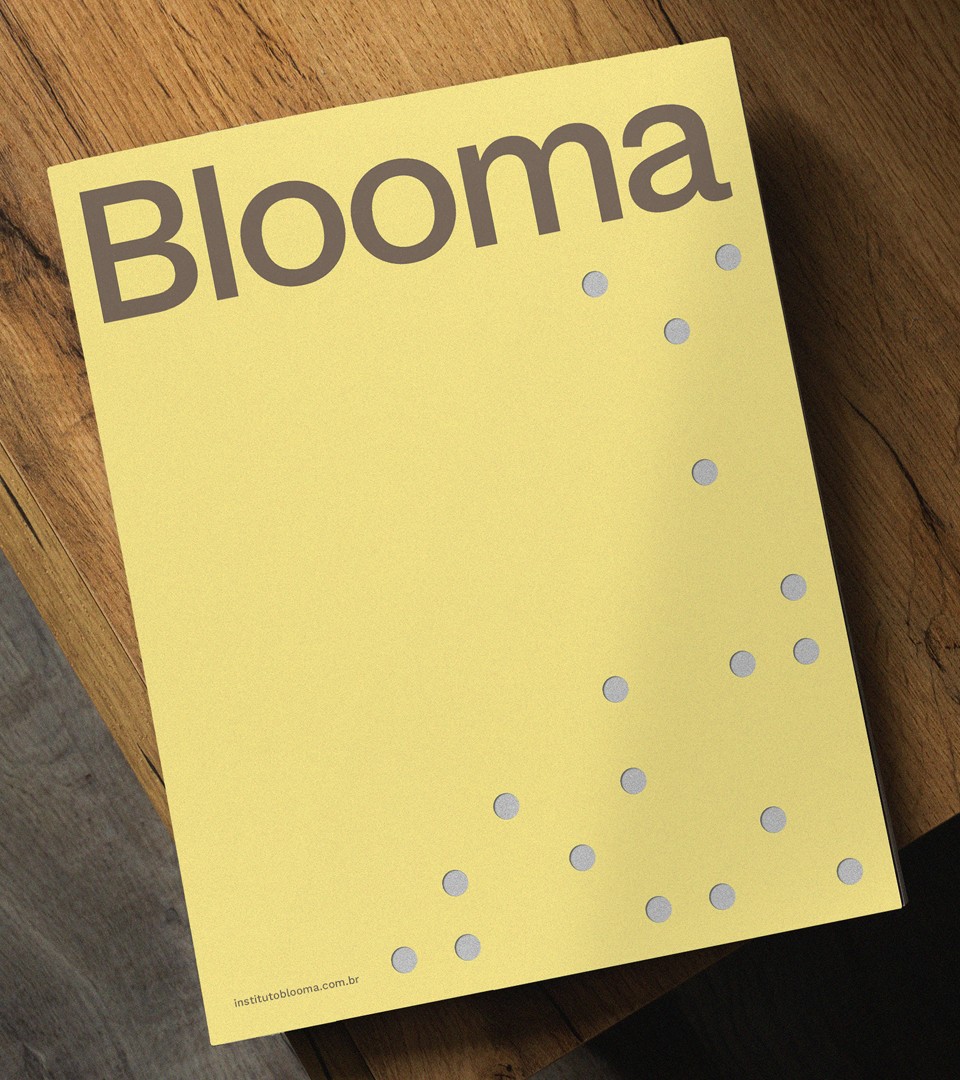
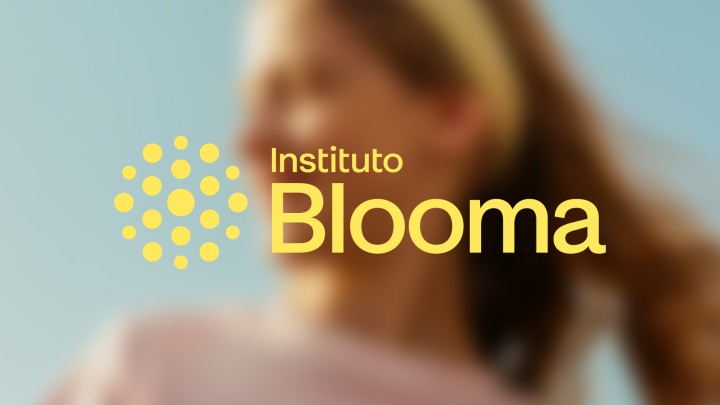
In line with this spirit, the institute's name was born. Blooma carries a sense of femininity, modernity, and lightness. Its meaning reflects personal growth and transformation, while its sound and spelling evoke a vibrant, youthful world.
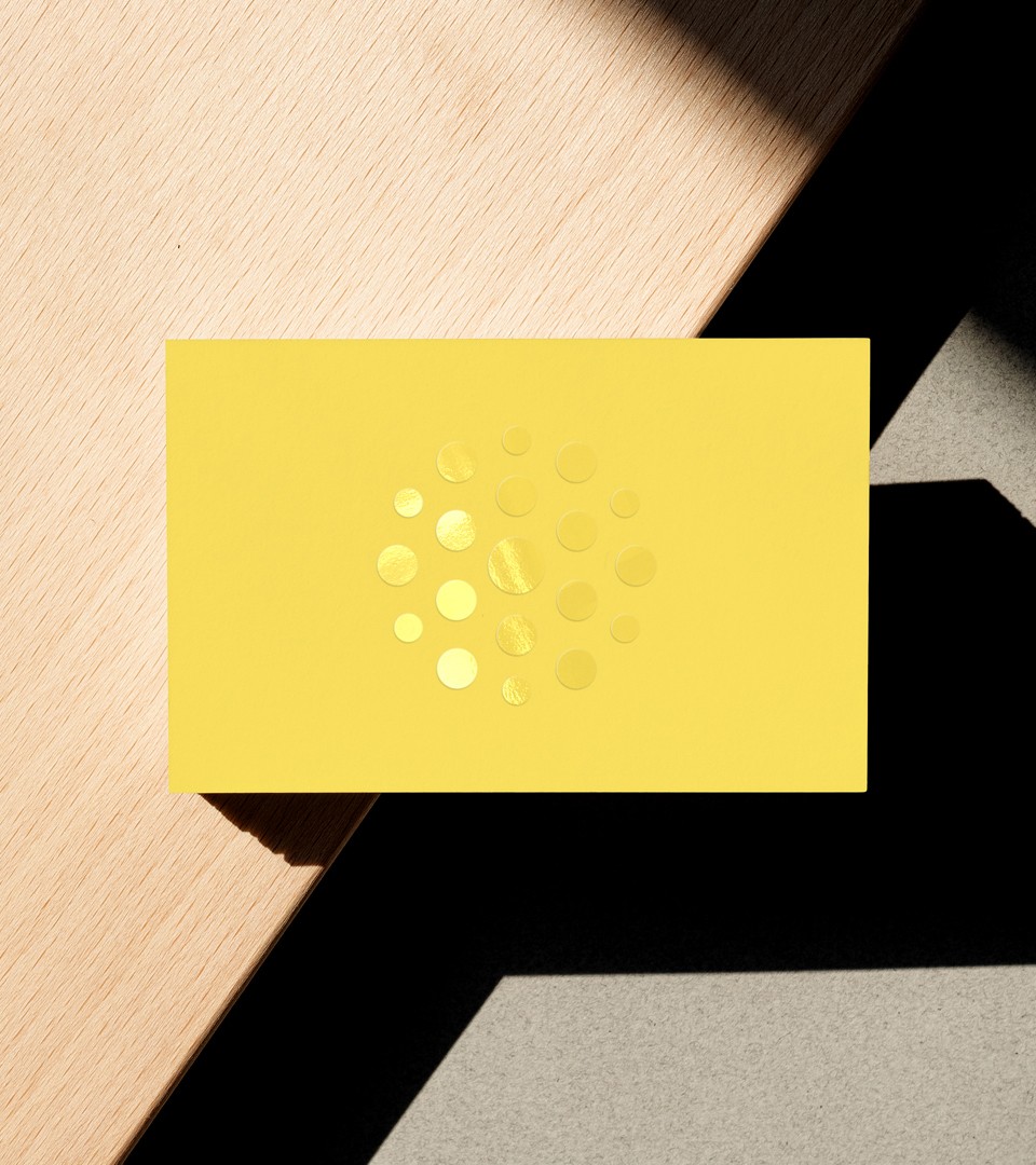
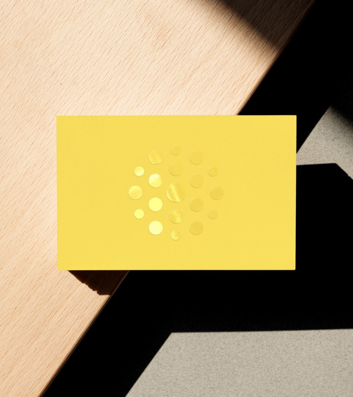
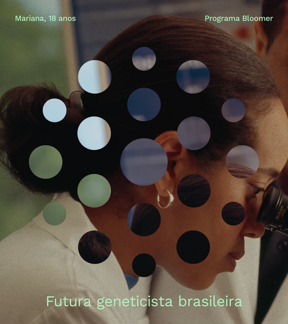
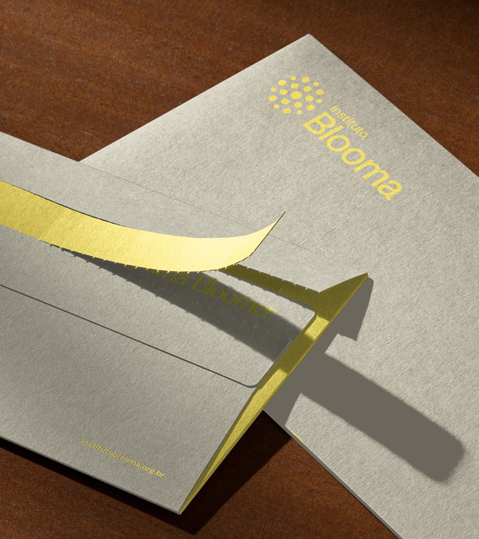
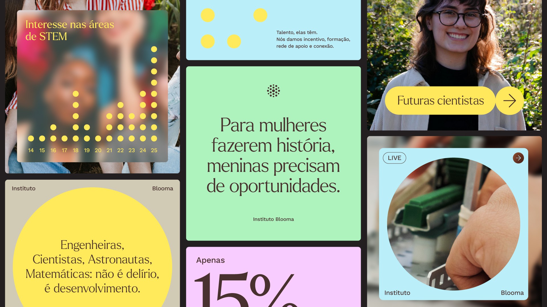
At the core of the visual identity, we crafted a symbol that draws inspiration from its name and the collaborative ecosystem that blossoms from within. The varying sizes of the circles represent Blooma’s dynamic, diverse, and ever-expanding network, evoking energy, connection, and continuous movement. This foundational symbol captures the essence of the institute's ethos and serves as the cornerstone for the overall visual system.
The elements that shape this system arise from the dynamic new symbol, featuring circles that can expand and organize themselves logically, all while allowing for various scales. These adaptable shapes multiply and lead the viewer's eye, encouraging exploration of a diverse range of compositional possibilities.
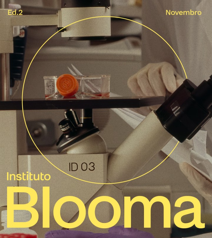
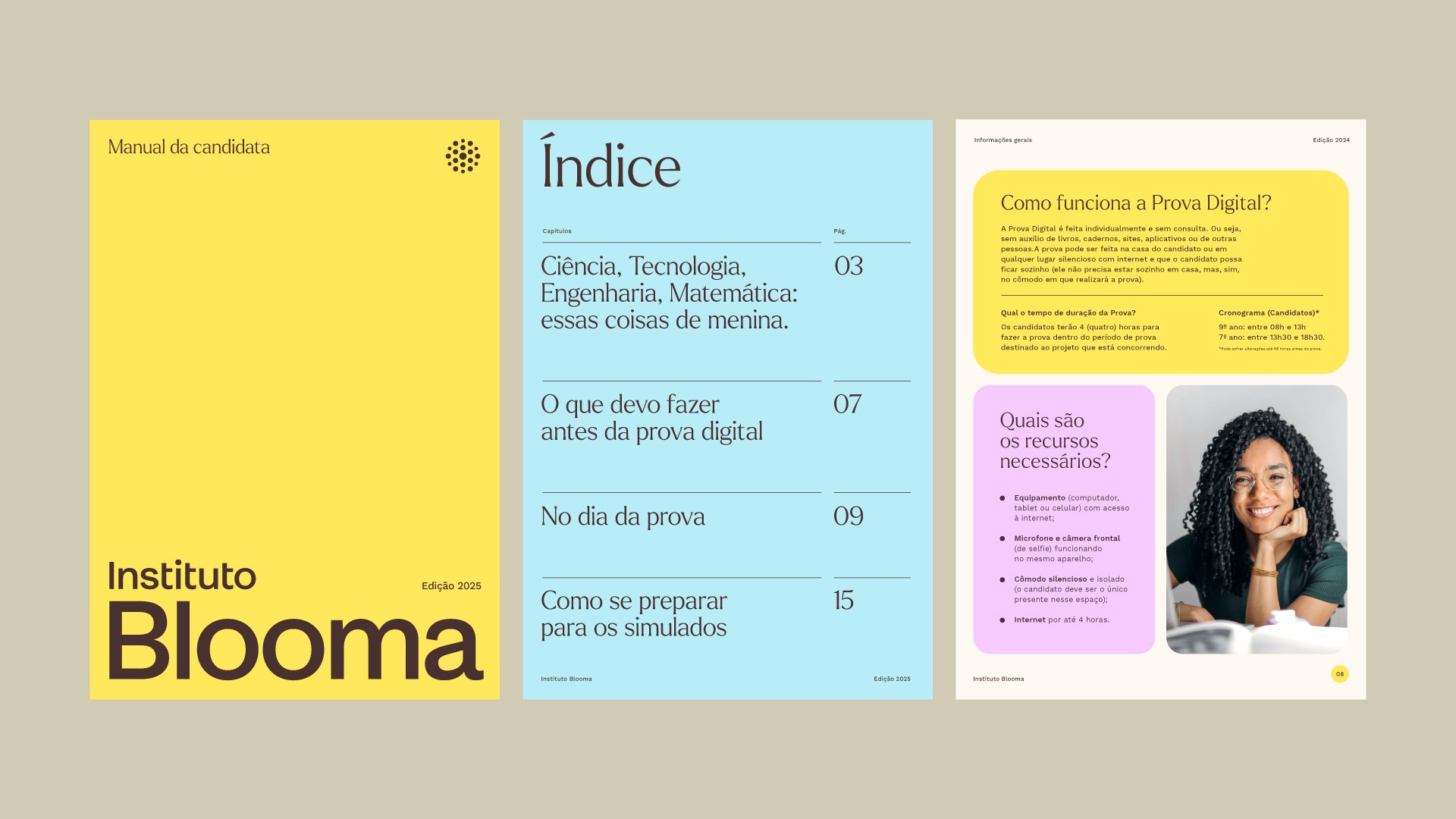
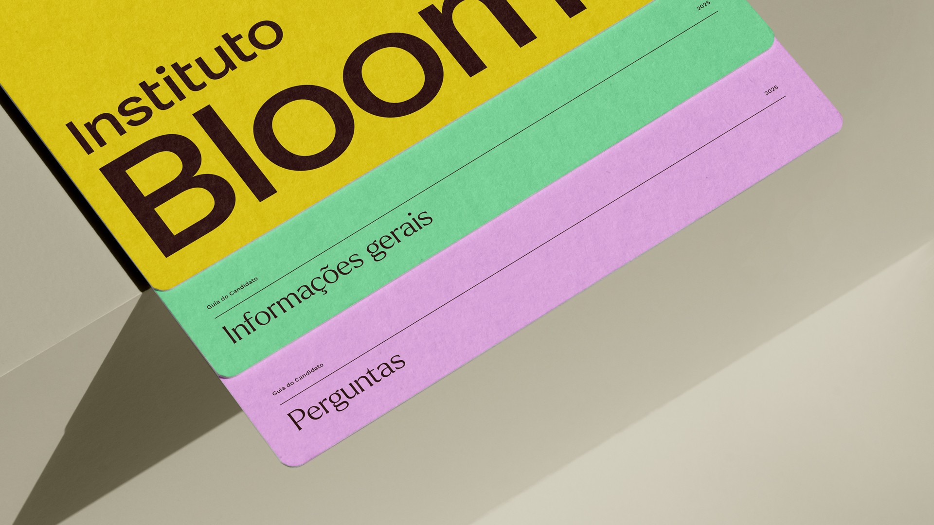
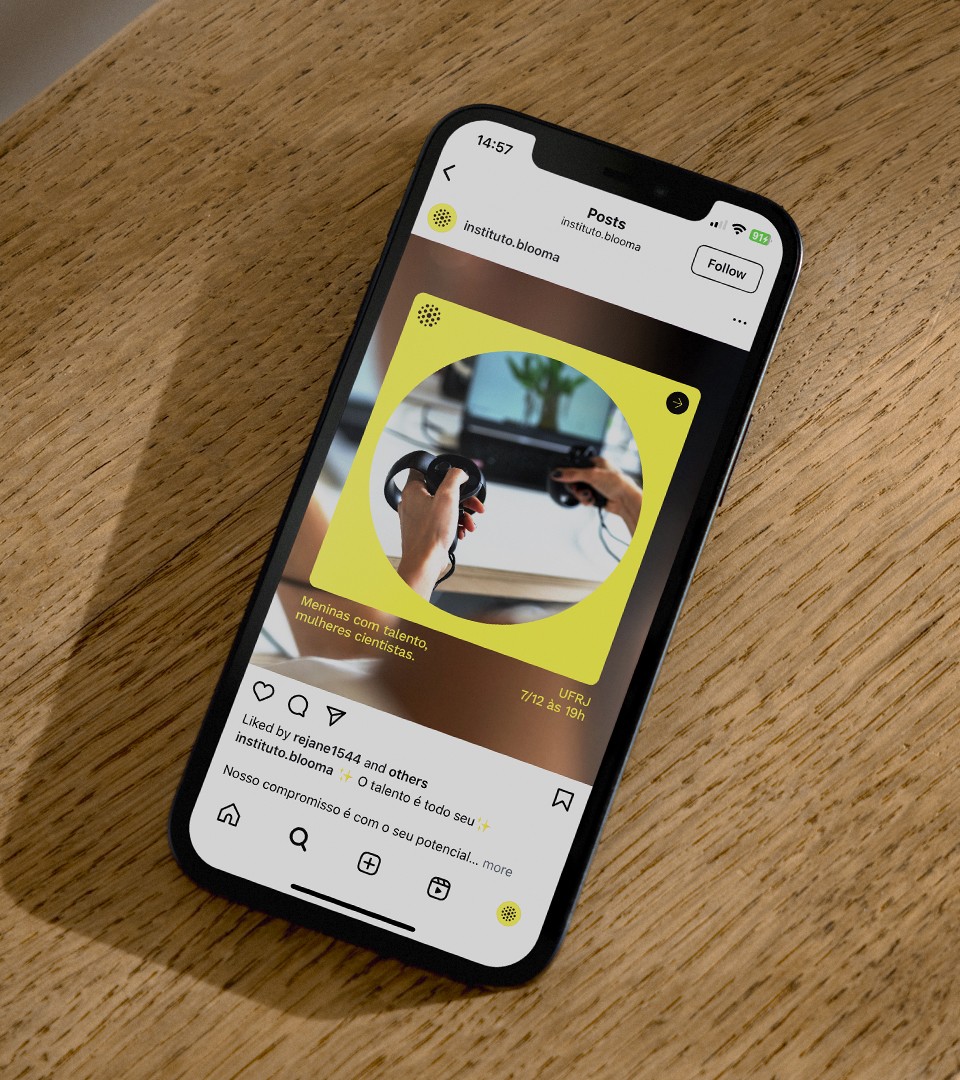
To enhance the visual narrative, we have incorporated elegant, simple typography and a light color palette that suits the target audience. The colors are more subdued when addressing parents and partners, while they become vibrant when speaking to girls. This careful integration creates a space for the institute to navigate across digital and physical touchpoints.
With a new name, positioning, and cohesive visual and verbal system, the Blooma Institute is set to spark change. More than preparing girls for the future, it invites them to shape it—on their terms, with courage, creativity, and the certainty that their place is wherever they dream it to be.