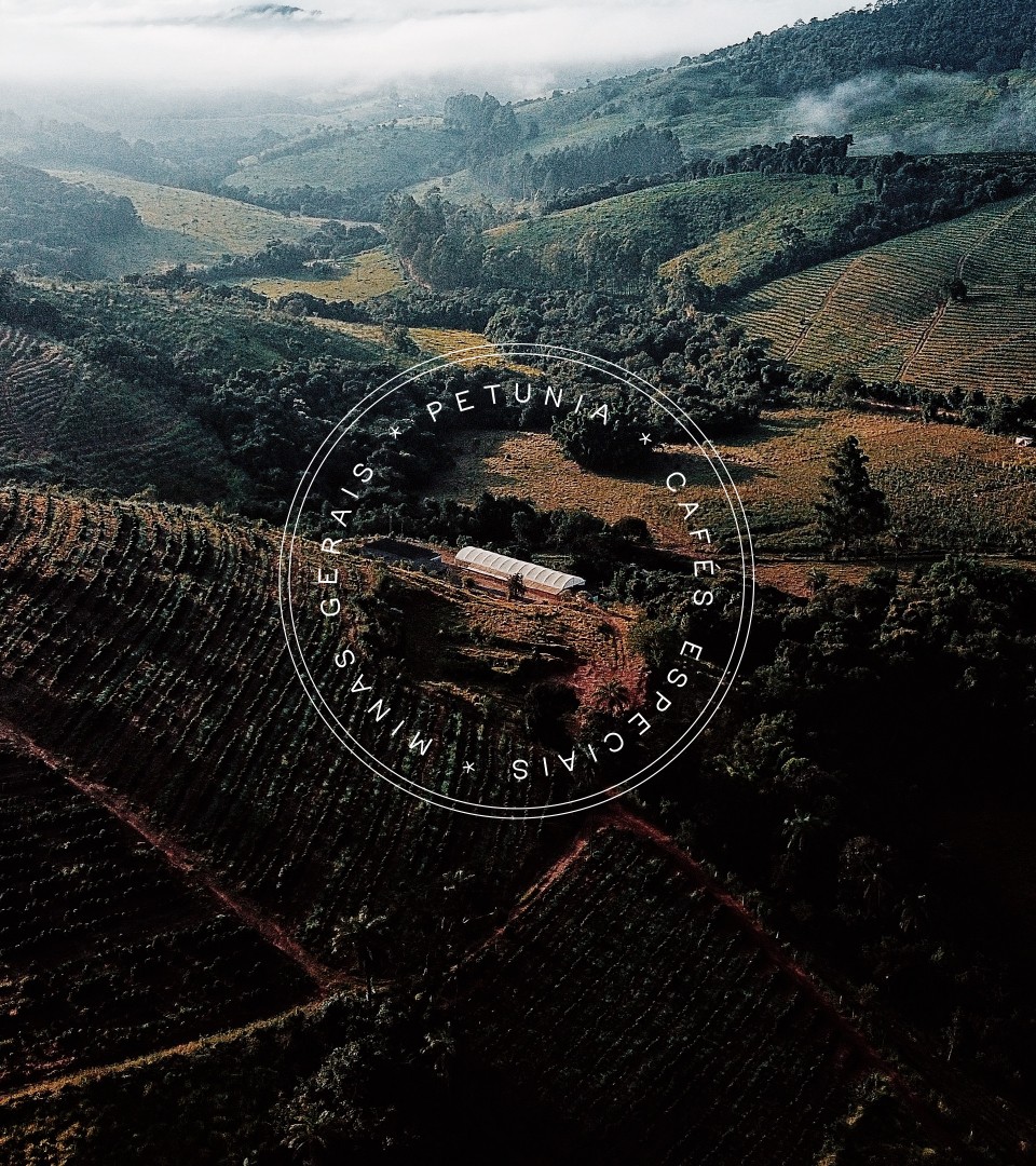
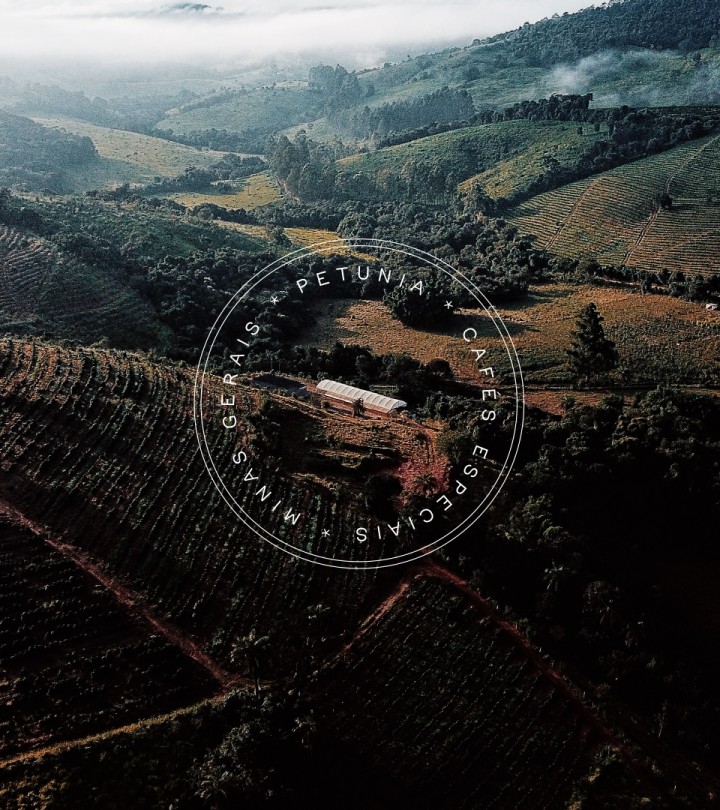
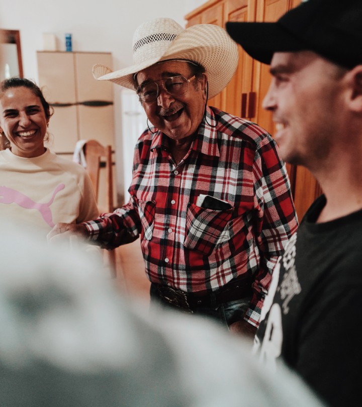
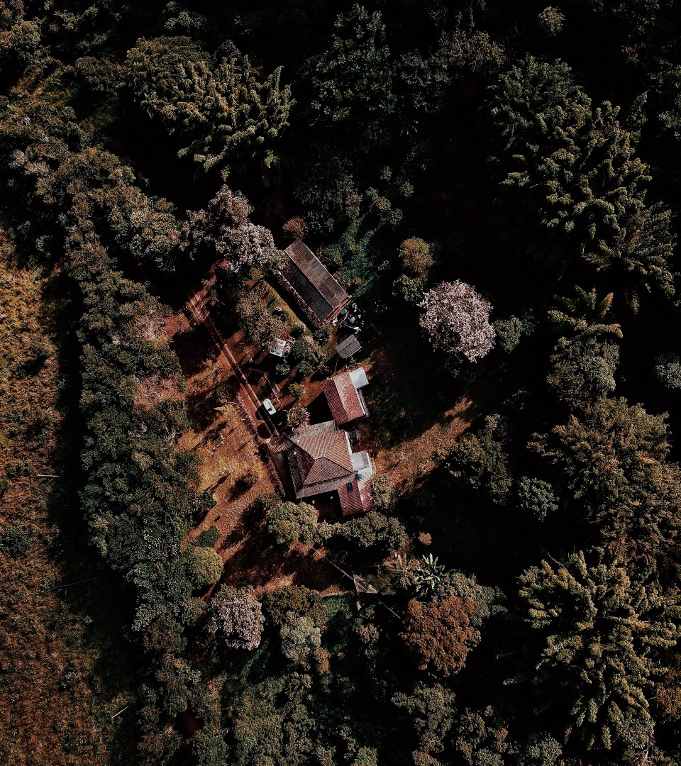
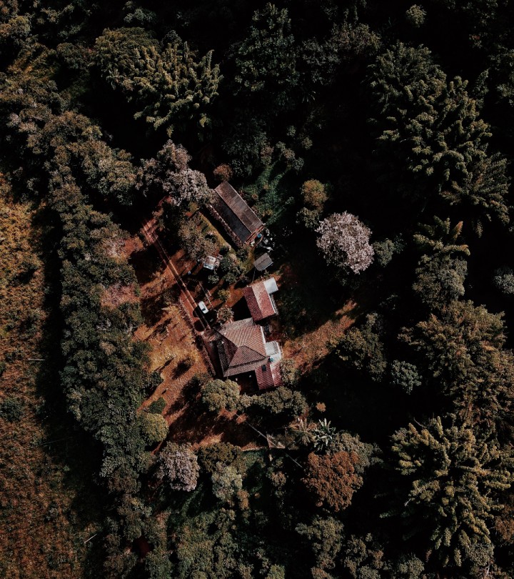
Petúnia is a specialty coffee brand produced at Fazenda Pinheirense, located south of Minas Gerais. With a dedicated and family-based operation, the founders ensure that their passion applies in all stages, from the selected exotic coffee fruits to the controlled fermentation and distribution in microlots, grains, or ground.
They approached us to help them evolve their brand and develop a new design system for their communication and line of packaging, seeking to conquer new national and international territories.
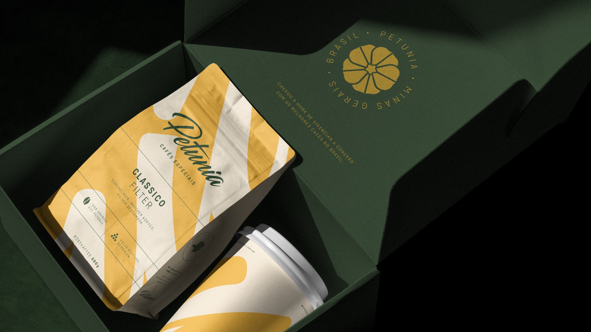
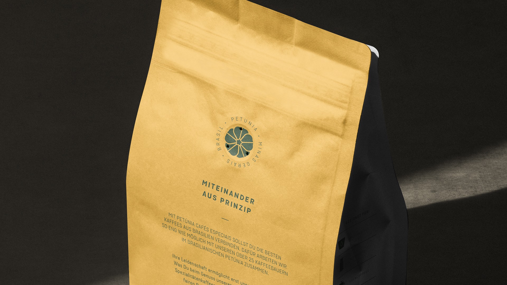
Our first move was to refine the original brand, correcting imperfections and simplifying its structure. We also updated the petunia flower illustration, which gained a new look and became a seal of authenticity, from now on, being applied unattached from the wordmark.
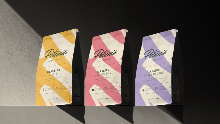
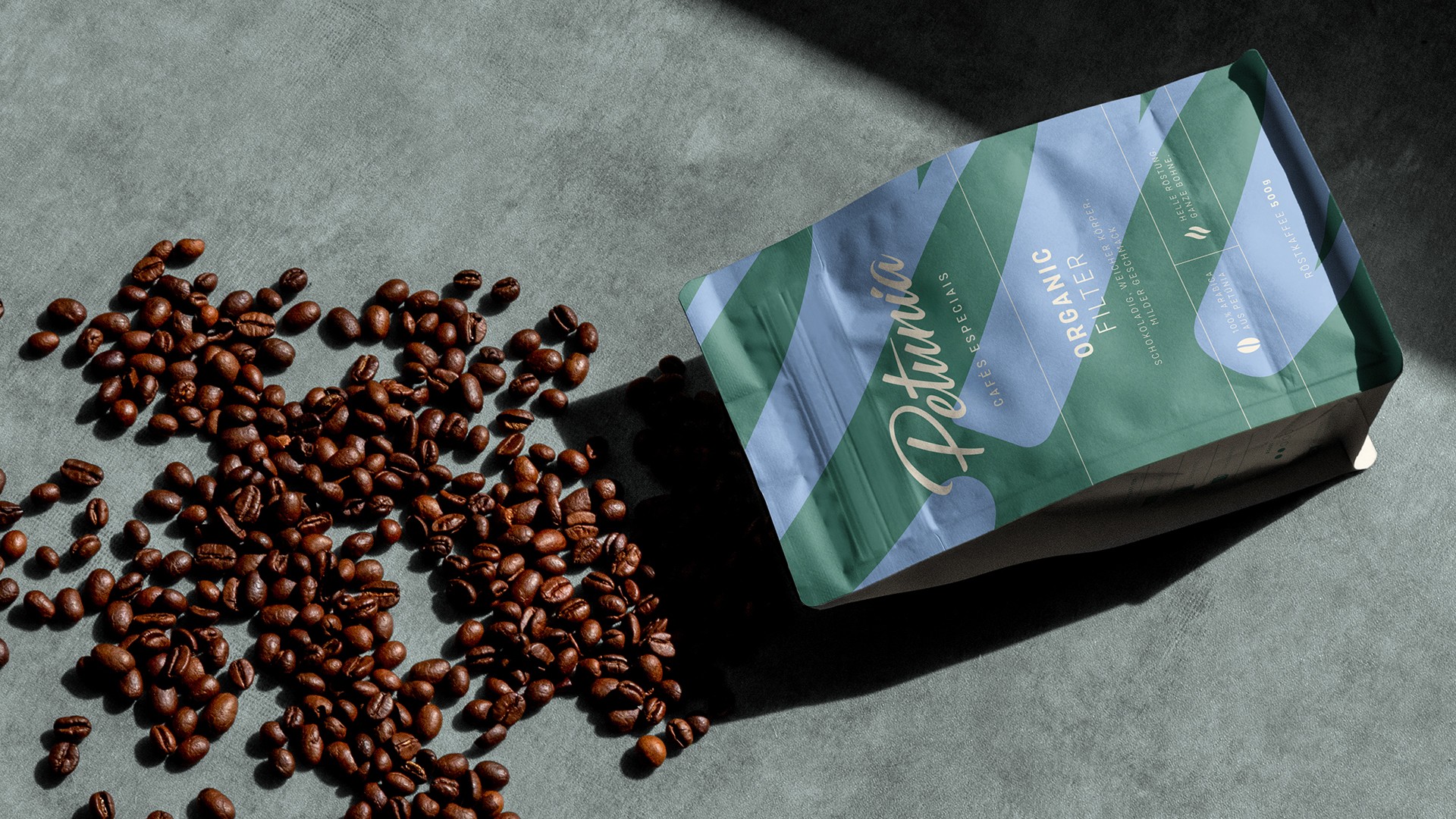
The design system introduces a complete transformation in the visual language, elevating the brand with simplicity and serenity. While the curvilinear details of the logo widen the perception of Petunia in the market, a soft color palette helps the shopper to navigate between the different types of coffees.
On the packaging, these elements are combined with a carefully thought-out information system to help consumers understand the distinctive characteristics of each product and what it has to deliver.
As Petunia's brand has evolved, it has maintained recognition with its local consumers and remained faithful to the heritage of its entire history. Supported by the new identity, this movement will help in its mission to continue building a community around coffee and a close, inviting, and more sustainable ecosystem.

