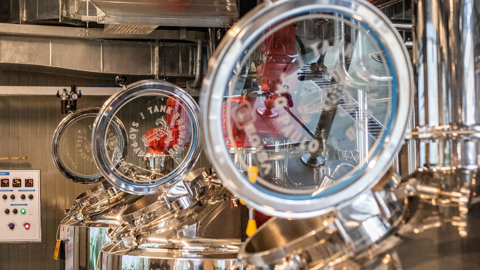
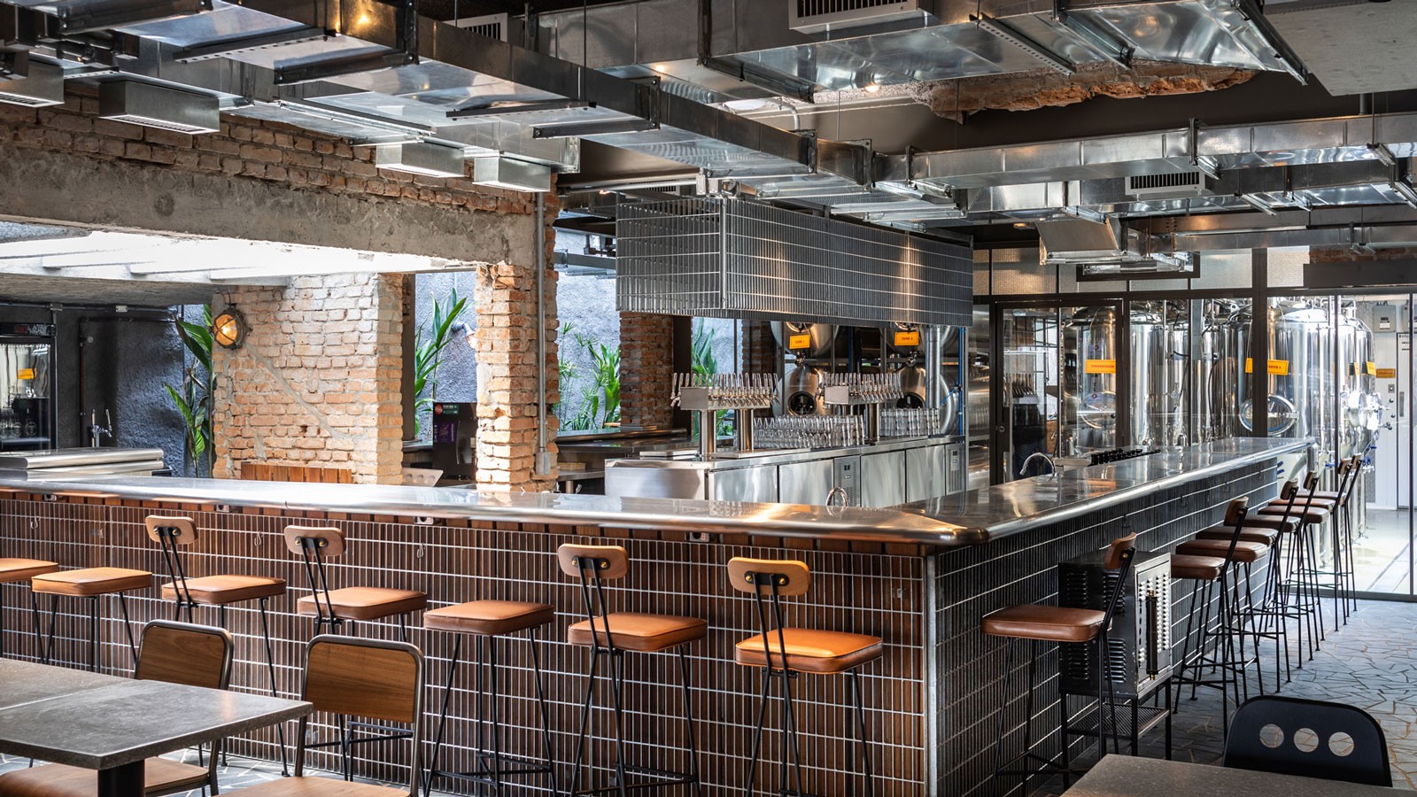
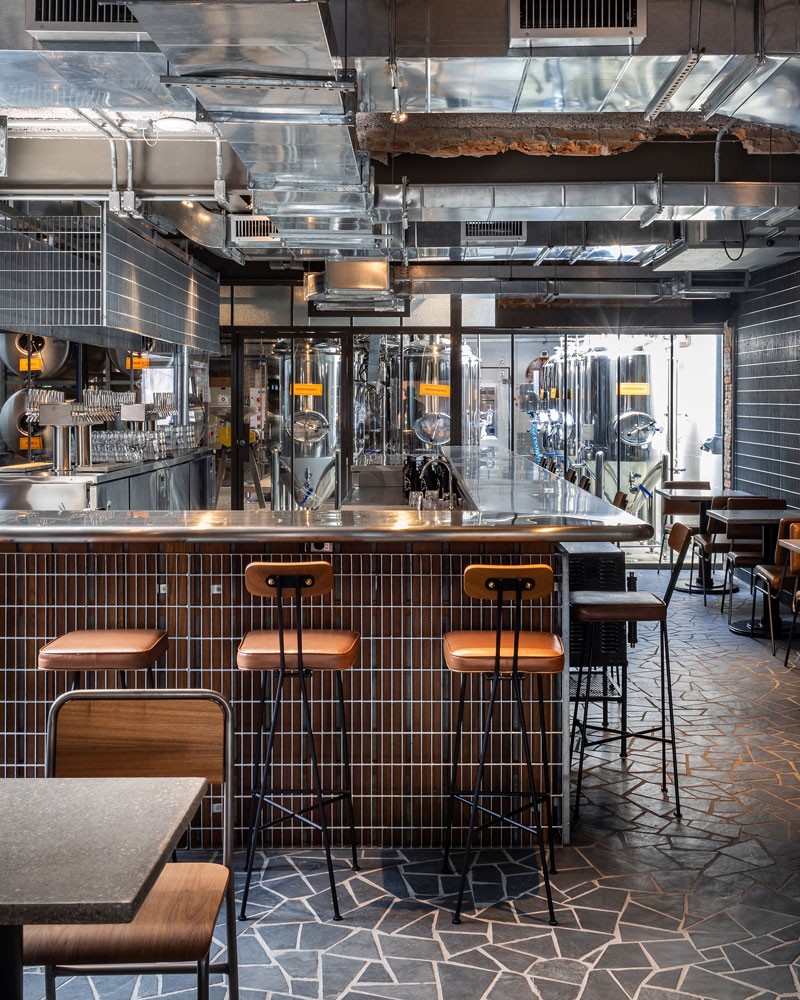
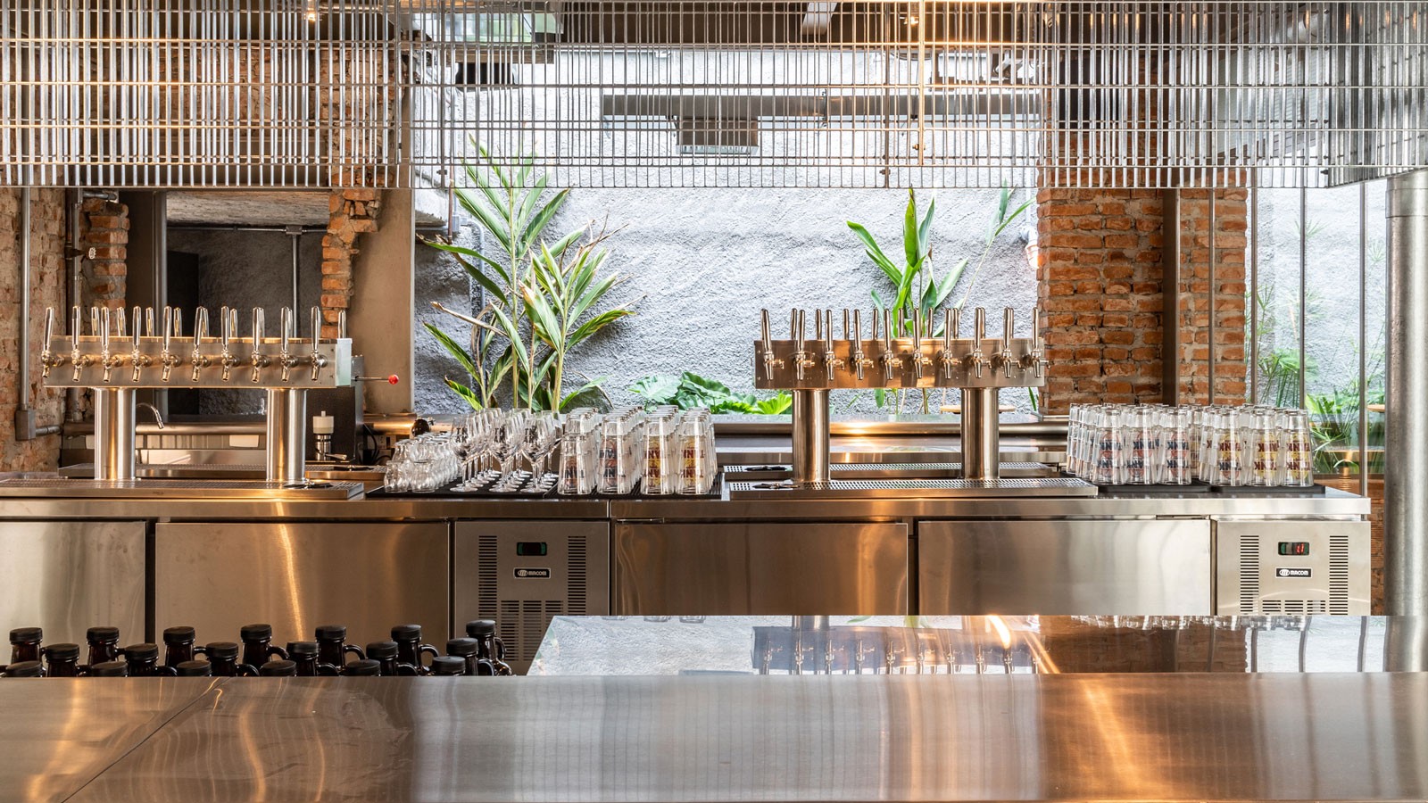
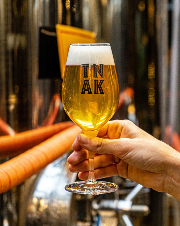
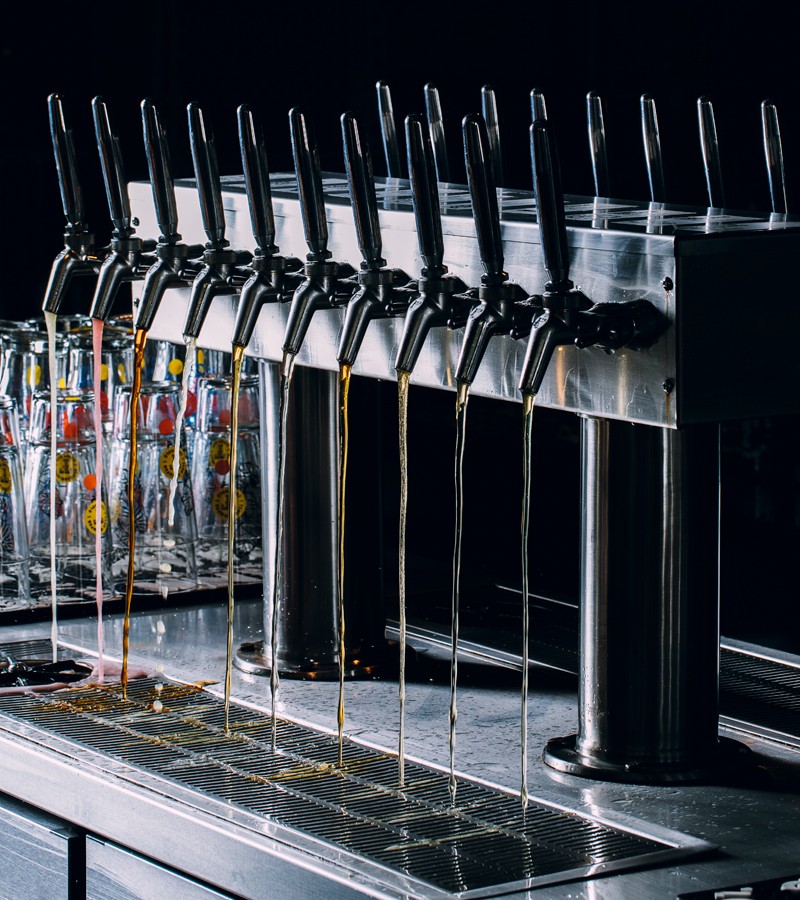
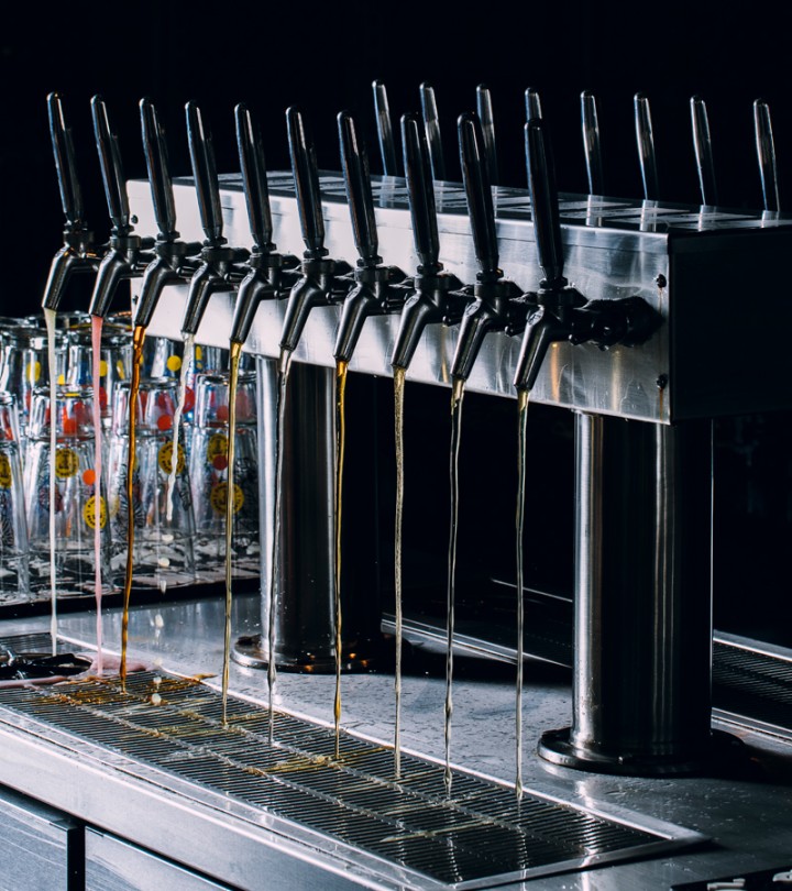
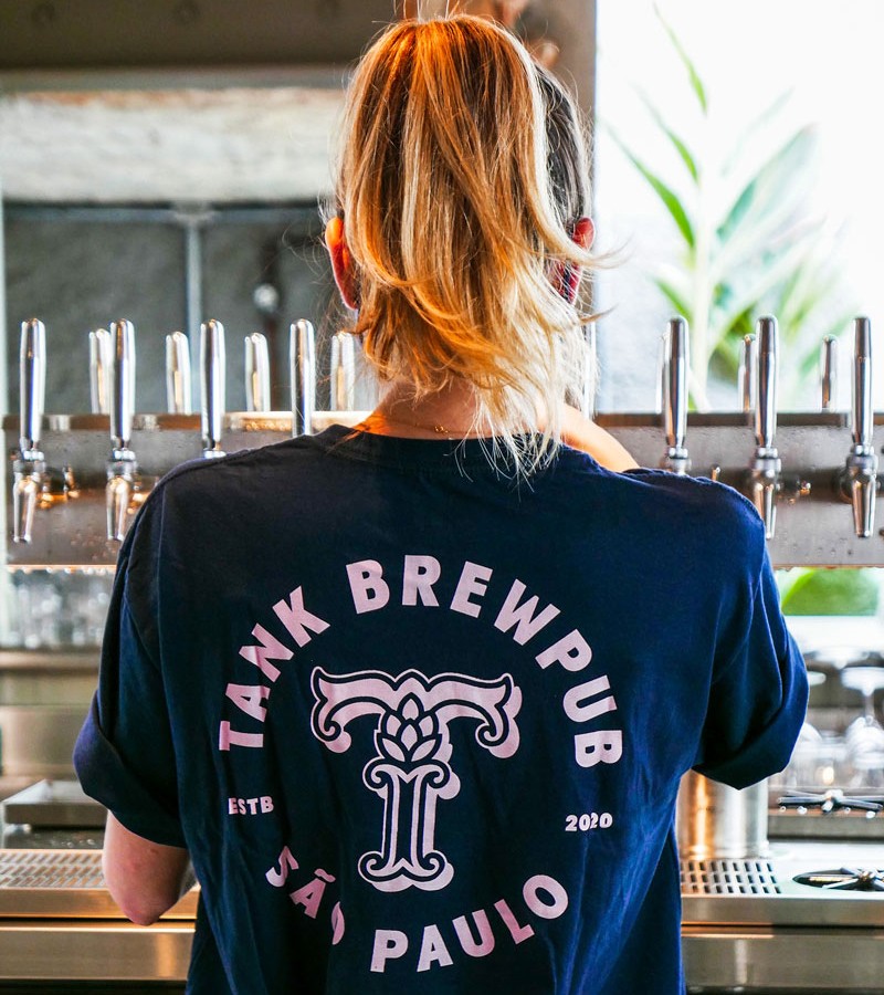
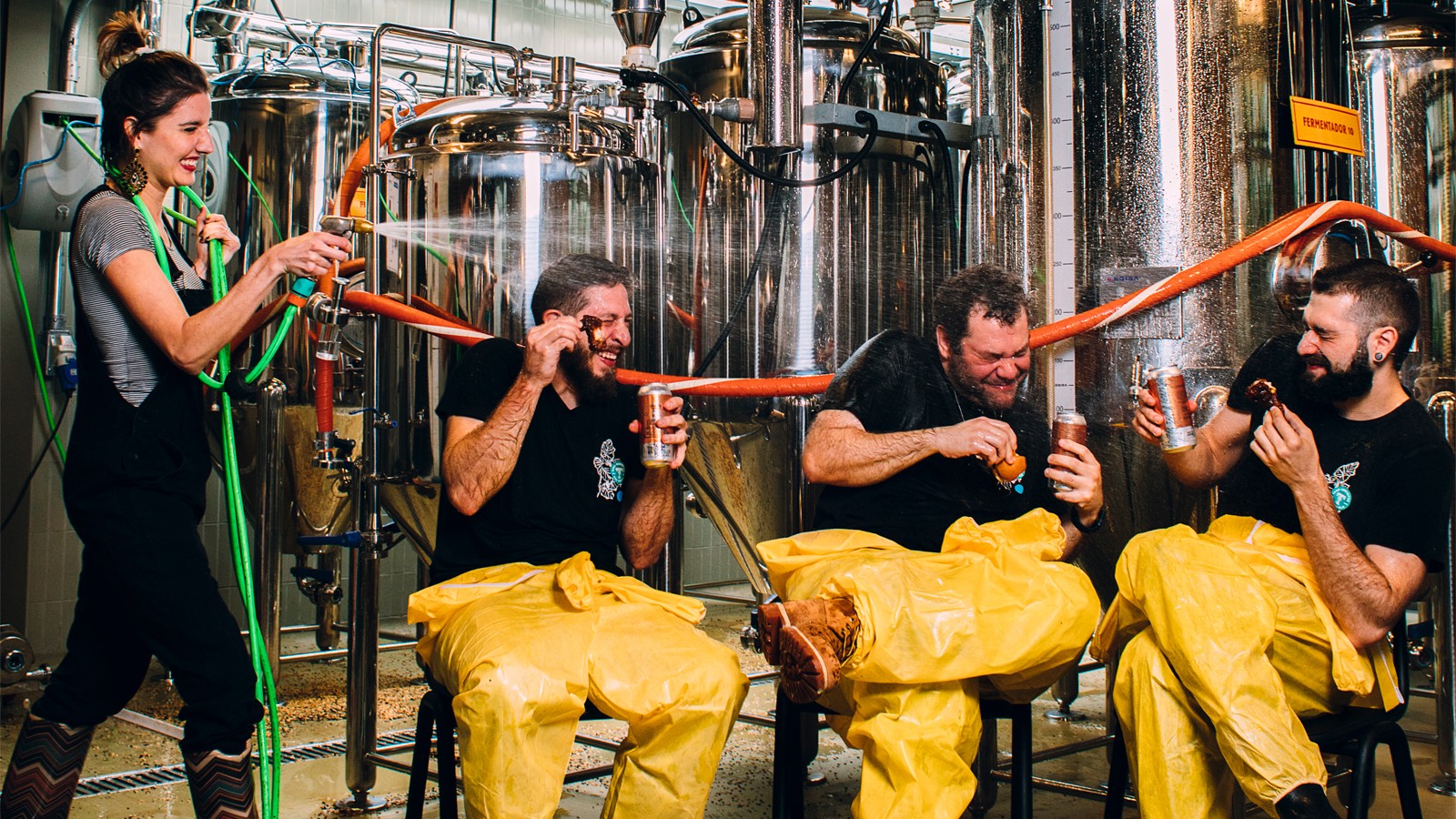
Located in Pinheiros, one of the main beer districts in the city of São Paulo, Tank is a brewpub that offers a unique experience to its customers. With a factory installed in the heart of a 1960s house and 15 taps serving its beers, the brewery can produce 8,000 liters of beer. We were invited to develop a brand strategy and visual identity that reflects the essence of the place.
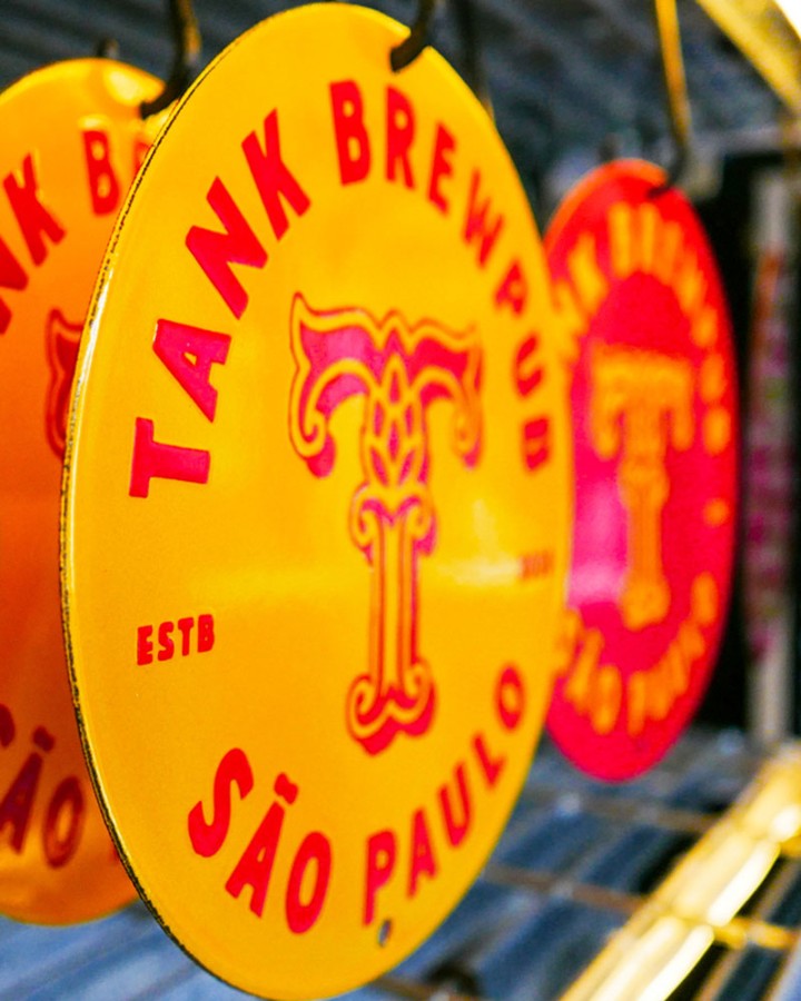
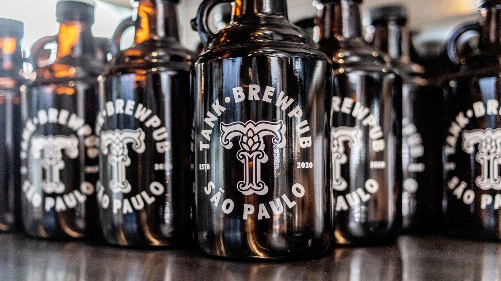
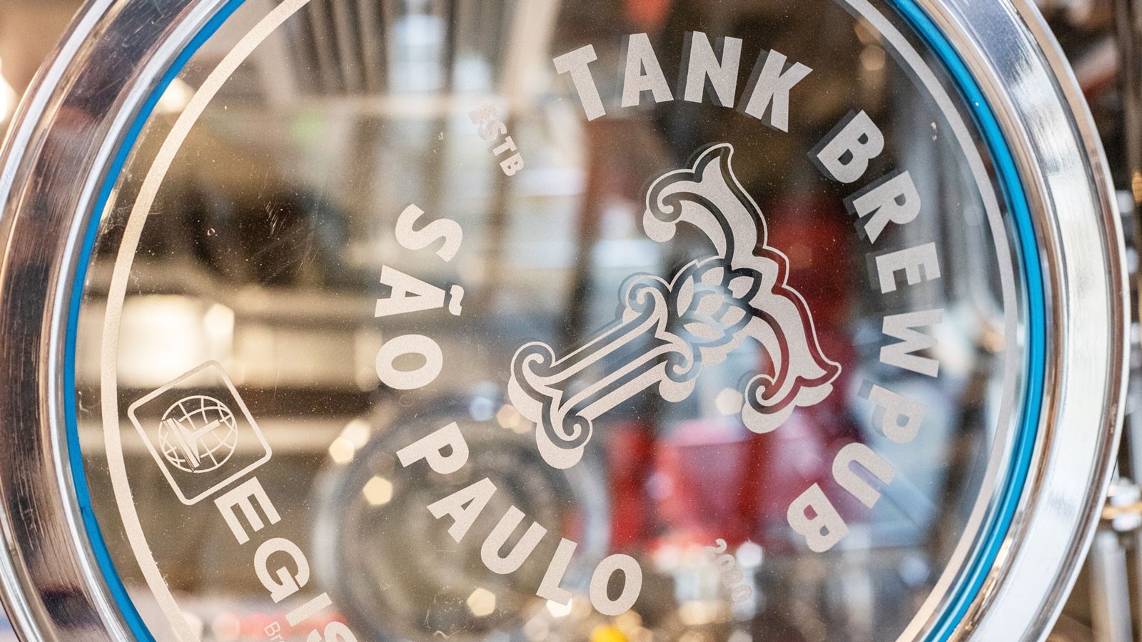
Starting with the brand, we created a symbol that pays homage to hops, placing it on a pedestal while also serving as the basis for the structure of the letter T design. In addition to its main version, the system has four variations that function as seals for applications at various contact points.
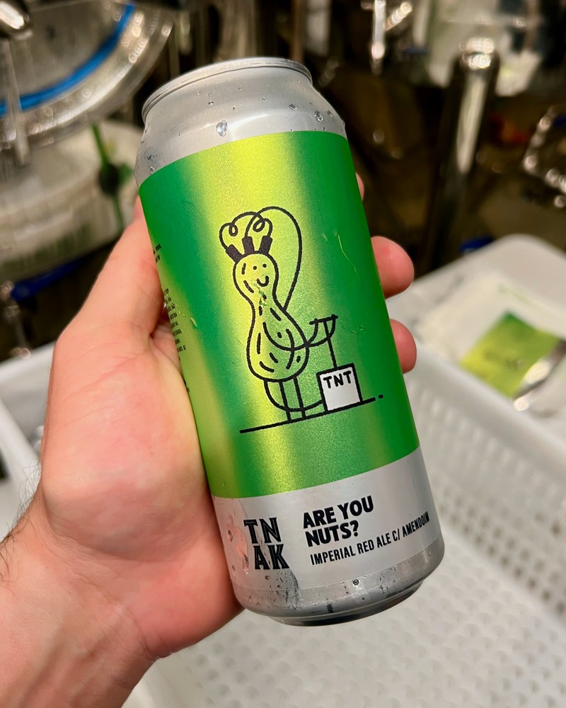
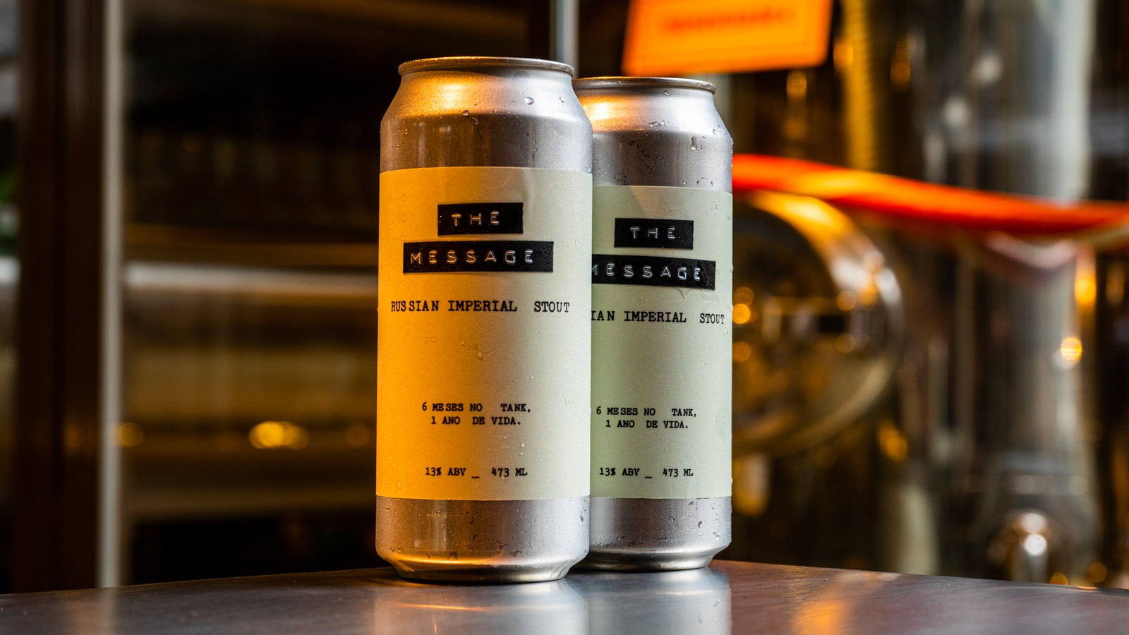
The visual identity stands out for its bold typographic compositions and a vibrant color palette, while the packaging plays with illustrations, developed by Papanapa, that oscillate between the everyday and the surreal. Throughout our partnership with Tank, we have created more than 100 unique labels, each telling its own story.
